
JUBA, South Sudan — A regularly updated, intricate new map seeks to be the first to identify service points, communities, and topography all in one place — in one of the most challenging humanitarian contexts in the world.
In an attempt to better understand the movements, decision-making patterns, and social structures of inaccessible communities across the country, the United Nations Children's Fund created a social map. A digital and printed map that combines topographic and geographic information with social institutions, which can be used to inform strategy, budgeting, partnerships, monitoring, and evaluation decisions.
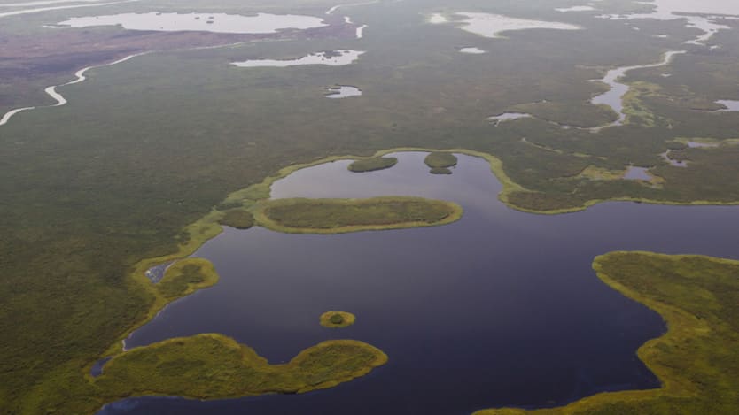
South Sudan’s lack of infrastructure, road networks and access to information makes it exceptionally challenging to navigate — and access the country’s most vulnerable and remote populations.
“When implementing our programs, we were coming up with a lot of issues. There were places we’d go to but had no idea that there was a river in the middle and you couldn’t cross, or you’d find a village and realize you couldn't get there,” said Shah Jamal Akhlaque, communication for development specialist at UNICEF and the map’s mastermind.
South Sudan is a unique country to operate in because there is no updated data on social, economic, and demographic issues, Akhlaque said. Most of the available printed and web maps, including Google, don’t have details showing infrastructure and social institutions.
“We didn’t have any information anywhere,” Akhlaque told Devex. “If you asked the health department how many facilities they had, they had no idea, let alone if they were functional or not.”
In an attempt to cut costs, boost efficiency, and reach the country’s most vulnerable people, Akhlaque pioneered South Sudan’s first social map, which he says has the potential to be the nation’s “backbone.”
Seven states with easier access have been mapped using location coordinates, with the help of other humanitarian agencies.
However, the three states that are hardest to reach — Jonglei, Upper Nile, and Unity — where security challenges make it hard to establish coordinates, were done by UNICEF using a community‐based mapping system, where leaders would manually insert details such as the locations of social institutions from their villages and towns. This is an approach that Akhlaque says is “new, even to those working in the mapping industry.”
Initiated in 2015, Akhlaque’s team has mapped 85 percent of the country to date, with only the state of Central Equatoria remaining. His team of 30 people has finished the three hardest-to-map states, and once the project is completed in September, the plan is to update all of the state maps every year, and the county maps every six months.
Devex sat down with Akhlaque to find out more about the maps UNICEF created for the three remotest states and how they’re benefiting humanitarians and communities.
The conversation has been edited for length and clarity.
What exactly gets mapped with a ‘social map?’
We divided all of South Sudan into three categories: Town and camp; villages; and scattered settlements. The biggest challenge was tracking the population, so first we mapped the population and the location — who’s living where. For example, were people living in internally displaced persons camps, villages, cattle camps or were there refugees on the move?
We also mapped social institutions, NGOs, churches, mosques, schools, community and faith‐based organizations as well as collected data on opinion and religious leaders and traditional healers. We mapped facilities such as loading and unloading areas, guesthouses and seasonal access areas, as in what’s accessible during the rainy and dry season and what’s not accessible at all.
What was the biggest problem you were trying to tackle?
The main problem in South Sudan is the mobile population. Unlike other neighboring countries, like Somalia, where the population is homogenous, South Sudan is different.
In Somalia they have camels, they move for water and grass. Here you have fishing groups, pastoralists, pure nomads, and internally displaced people, so there’s a different type of movement pattern. If you can’t understand their movement you can’t access them. In Somalia, you just track the water points — and it’s the same in Ethiopia. Here, until we had the social map we didn’t know how to track them.
Once we saw the map we realized they were moving from cattle camp to cattle camp. Other mobile groups move from fishing camp to fishing camp and armed groups live in the barracks and take over barracks from other armed groups they chase away.
Until we had the maps we didn’t really see any of this.
How have the maps helped aid workers?
It’s an information-based guide, so we now know exactly what’s going on and where. It’s also helped with planning, program effectiveness, and cost reduction.
It’s significantly reduced our costs.
For example in 2015 and 2016, we only used to hire community mobilizers for the four polio campaigns each year. Each campaign was six days, and so people used to work almost 24 days a year and we’d have 1,500 community mobilizers.
Now with the maps, we’re maintaining 2,506 mobilizers year-round, working 20 days a month — so 140 days a year, at almost the same cost. We’ve cut down on logistics like trainings, banners, posters, and megaphones, as well as unnecessary movement because we know where people and things are and we know the distances between places.
Before mapping, we used to deploy our frontline workers to some areas that might be completely empty and we’d send someone else to an area with too many people that they couldn’t handle on their own. South Sudan is not that simple, as many of the villages have around 20 miles of distance between them and there’s no road. So if we deployed one person to do community outreach in two communities it was often too much to cover on their own.
In general, it helps us to better understand communities because we now know their location, language, the different gangs in each community and decision-making structure. We know their movement patterns and which time of the year they do what, so when we want to reach them regarding their children — for example for immunization — we can find them.
How have these maps helped communities?
Earlier there was confusion over boundaries. There weren’t any borders between counties or villages but we outlined this with the maps. So now if a county leader doesn’t know his area he can look at the map and he knows which village belongs to which area and he knows his accountability.
What benefits have there been in relation to conflict?
We’re able to show the location of the armed groups, so when aid workers go into a specific territory we can communicate with the right group. If you don’t have the map it can be life‐threatening because if you don’t know the area of the group, they can ambush you.
What’s the process of mapping South Sudan?
We started with the outline of a map, which we got from UNOCHA [United Nations Office for the Coordination of Humanitarian Affairs] and we sent it to our local colleagues in the field who drew a hand map defining their specific areas of towns and villages.
There were two maps, one was aimed at security to define specific areas for what was safe and what wasn’t, and the other defined the boundaries of the counties and villages and other social institutions.
We then sent this map to a company in South Africa called Handmade Communications. They further defined the maps, specifically the borders, by using digital technology and satellite imagery. South Africa sends the maps back and we have our field team look at both maps again and compare the locations of the villages, landmarks, and geographical features.
From here the field team works on populating the maps with information. So you’ll have a table of people all sitting together, with someone from each village and county inserting specific community information into it. They’re covering areas that aren’t accessible, adding things like churches, mosques, schools, hospitals and they include this information by hand.
After sending the verified maps to an outsourced agency overseas, the manual maps were combined with the satellite maps using a method called Georeference. The software used for this is called QGIS. The maps are then exported to Adobe Illustrator, another software, where they’re finalized and minor adjustments are made.
What advice would you give to others in the mapping industry?
From the technical side, it’s better to do a sketch map, but you have to have an outline. If I draw a map from my hand alone I might not have the correct proportions so people should first have an outline of the country.
Then inside the map, you can sketch the boundaries and social elements. You can also collect coordinates from Google Maps and by having coordinates you can extract a map and do the triangulation.
In emergency countries like South Sudan, with no infrastructure, where it’s hard to move from place to place, or in countries with inaccessible areas, you need these maps. We shouldn’t plan on the population only or on the number of households, which happens most of the time.
When you plan any programmatic intervention you need to consider many things, such as the type of population, the demographic and social practices, the location and the decision structure. For example, if it’s about immunization we need to approach mothers. Or in the cattle camps, we need to approach the fathers and community leaders if it’s related to child marriage. The social maps help us with this.
What surprised you when creating and implementing these maps?
I got some resistance from all of the actors in the field in terms of using and implementing the social maps. The maps increase transparency and so monitoring becomes stronger which some people might not be in favor of. In some situations, partners and authorities like to take advantage of the situation and hide information and use it in their favor.
For example, South Sudan hasn’t done a census since 2008, yet they continue to make population projections every year, which indicate an increase in numbers. But South Sudan’s population is actually decreasing every year, so there’s a gap between the estimated population and the real population.
If you’re planning an intervention, mobilizer, vaccination or distributing food, you’re planning based on the population. If you use the social map, costs will get reduced and some people might prefer to have more people estimated to be in the country. People like to use the data for monitoring and movement, but when it comes to using it for micro‐planning, budgeting or agreements they have a tendency to ignore the data.
About the author

Sam Mednick
Sam Mednick is a Devex Contributing Reporter based in Burkina Faso. Over the past 15 years she has reported on conflict, post-conflict, and development stories from the Middle East, Africa, Asia, South America, and Europe. She recently spent almost three years reporting on the conflict in South Sudan as the Associated Press correspondent. Her work has also appeared in The New Humanitarian, VICE, The Guardian, Foreign Policy, and Al Jazeera, among others.